Overview
Kerri Pratt, is a fine artist and winner of the Jonathan Vickers award 2014/15. Foundation Derbyshire runs the biennial award, which is presented to a rising artist to produce work inspired by Derbyshire’s landscape, heritage and people. The artist’s period in residency culminates with an exhibition of completed works at Derby Museums. An exhibition catalogue is designed and printed to accompany the exhibition.
Kerri worked with University of Derby design student Adam Khalifa to produce the design for the exhibition catalogue. Foundation Derbyshire’s Helen Bishop, Chair of the Jonathan Vickers Fine Art Award Committee, helped to project manage the production of the exhibition catalogue. As the design of the exhibition catalogue was quite complex Kerri, Adam and Helen met with Bowden and Sons in the very initial stages of production to discuss possibilities, options, techniques and stock.
Requirements
The exhibition catalogue was designed to reflect Kerri’s paintings; the cut out pockets and inserts are inspired by Kerri’s working methods whereby she edits and manipulates the composition of landscape through the use of simplified geometric forms.
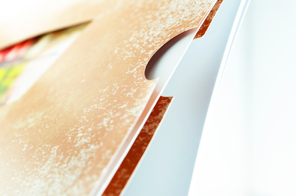
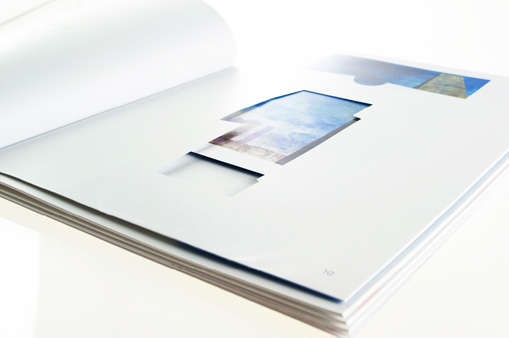
A key part of the exhibition catalogue are the 3 die cut wallets. These needed to be durable and sturdy so they didn’t break when the small pieces of artwork are removed and replaced. The insert itself needed to be of good quality as the artist felt that these individual pieces would be treated as mini works of art.
In addition, a high degree of accuracy on colour representation was paramount to ensure that the exhibition catalogue felt like a continuation of the exhibition.
Part of the design was to incorporate texture, Adam, the designer’s view point was that this was very important as again it was echoing the physical process used in the production of Kerri’s paintings.
Finally, it was important that the stock used for the exhibition brochure was from sustainable sources.
Solution
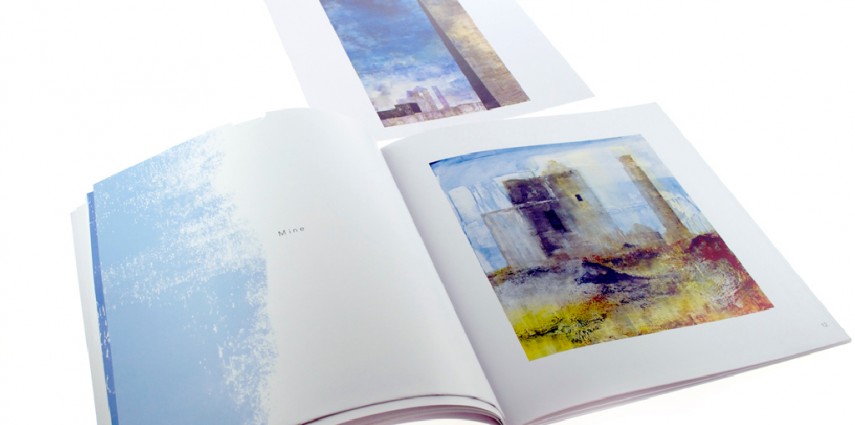
A four colour lithographic printed exhibition catalogue that comprises 52 pages, 4 for the cover and 48 internal pages. The cover is printed on 300 gsm uncoated paper. The internal pages are 170gsm satin coated stock.
The catalogue contains 3 internal die cut pockets that are finished by hand. Each pocket contains a pull out insert that is previewed through the die cut pocket window. The insert is printed using the same technique as the other internal pages. All the pages are coated on both sides with an ink sealer. The ink sealer makes the print more durable, it also reduces any instances of print transfer. When there are full colour pages opposite white pages there can be ink rub off from the full colour page to the white page, the ink sealer prevents this.
Environmental concerns have been addressed by using FSC (Forest Stewardship Council) approved paper. This means the paper using trees from sustainably managed forests.
Results
A beautiful, fine exhibition catalogue that excites viewers in feelings of quality, texture, intrigue and engagement. The stock used for the front cover of the catalogue has a texture, making it tactile, introducing another sensory element to the print and importantly echoing the physical process used in the production of Kerri’s paintings. The result of using satin paper for the internal pages is that the colours (the ink) look deeper, sharper and glossier.
Technically this exhibition catalogue was tricky to produce with the die cut and pocket detail, the end result and the techniques used have ensured that the pockets don’t work loose.
Kerri said “we were very happy with Excel right from the initial meeting; everyone we spoke to was knowledgeable and clearly explained the production process and presented us with different options to consider in order to overcome some of the technical challenges with the design. Everyone we came into contact with was very knowledgeable and professional and it would certainly be a company that I would recommend and use again. During and after the exhibition many people have commented on how original and enjoyable they have found the catalogue.”
Helen Bishop said “We had not worked with Bowden and Sons previously. We were delighted with the advice, service and end product that was produced. We know this wasn’t a straight forward piece of print and their input was invaluable.”